Evaluation of final product
Activity one- In what ways does your media product use, develop or challenge forms and conventions of real media products?
|
The title of our film shows our media product to use forms and conventions of real media products. The title of our film is 'Hospitality'. This implies to our audience that the main protagonists will be in a new environment, which can be daunting for a group of teenagers. The implication of horror from the institutions and the 'chase scene' before the title, shows that the protagonists are going to experience negative hospitality. This conveys to the audience that the main protagonists are going to become uncomfortable, when the audience relates to the characters this will give them the experience of watching a successful horror film.
|

|
Title, font and style- The title has been positioned on a plain black screen to make the name stand out on the frame. It has been positioned a third of the way up and not quite in the centre which creates a disorientated effect. This gives the impression to the audience that the whole film will be disorientating and a conventional horror film. It has been written in bold capitals to show it to be unusual. The brown in parts of the letters make the text look like it has been rotting which gives the impression that the film will be scary and mysterious. The typography that has been used looks quite old fashioned which contrasts with the young girl that appears before the title shows.

|
The setting/location of our opening is in two main places. On the country lane, and in the protagonists bedroom. The country lane appears to be dark, isolated and is very quiet with no signs of life anywhere around- except for the lake. The lake is shown at the beginning of the opening and then reappears in the narrative shots with the group of friends. The lake is used as a link for the audience to put what is happening together. The trees that surround the country lane give off a gloomy effect and would make the audience know that something bad is at the end of the road. I think this is conventional as a horror film as it creates an atmosphere for the audience and creates a sense of dramatic irony. The audience are anticipating something to happen before they see the rest of the film.
|
The sound in this clip is synchronus sound of the river water flowing, this creates a calm atmosphere which gives the audience a sense of false security. This wide shot shows the lake and is one of the first establishing shots of the
area that we filmed in.
area that we filmed in.
|
Costumes/props- In our opening the first costume choice that is shown is the main protagonist Lily's dirty ripped white t-shirt, pyjama bottoms and dirty bottomed socks. This shows the audience that the girl has been running for a while and is running away from something that is possibly going to harm her. The beer cans in the narrative shots with the group of friends shows that the teenagers have little respect for the law and being respectful- as they are drinking on the streets. They are all wearing casual clothes as they had just been to a house party. Lily, the main protagonist is wearing all black which shows she is mysterious and shows she could be in danger but nobody notices. The watch that she drops in the dream and then finds the next day after the house party, this creates the main link to the dream and real life. The watch is the main prop and the most important to the story. The sound during this shot is the girl Lily screaming which shows the audience that she is in trouble but doesn't tell them why.
|
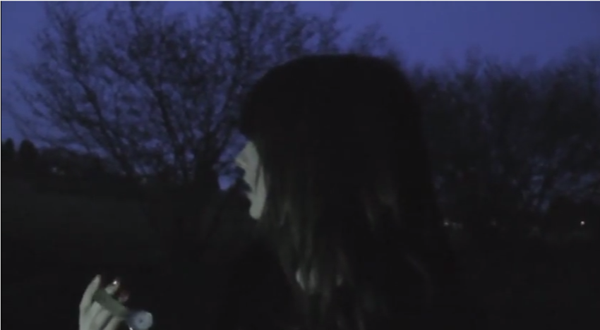
This long shot of the main protagonist Lily running towards the camera shows her to be running down a muddy lane, this shows the audience that she is in trouble and has been running for a while without any dialogue.
|
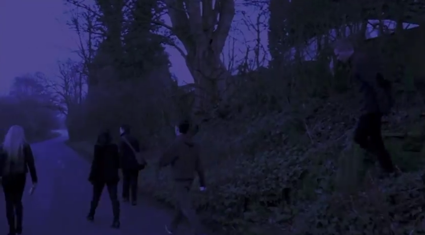
We used iMovie to edit our opening, we used transitions such as fades to black and we changed the video settings so the video looked darker and was at the correct volume level and speed. This shot shows the group walking aimlessly down a country lane, trying to find somewhere to go.
|
The camera work that we have used, has been used to create the effect that there is someone/something following the characters. This has been done using camera movement such as pans, zoom outs and tracking shots (clip through the trees) and point-of-view clips, to put the audience in the characters shoes which encourages them to sympathize with the protagonist. The camera angles and shots we have used have also been used to create the effect that someone is watching the group of friends. The wide shot when they walk off the steps creates the feeling that someone is watching them from down the road- perhaps from the B&B/person/thing that was chasing Lily. For the last shot, in which Lily finds her watch again we have used a close up, this is to show her facial expression and her reaction to finding the watch. It was also important that we got the watch in the mise-en-scene to show what she was talking about, so it can be related to the chase scene. This wide shot shows the group leaving the party- annoyed at Kyle for getting them kicked out! There is dialogue in this shot and high cut sound coming from the house party.
|
|
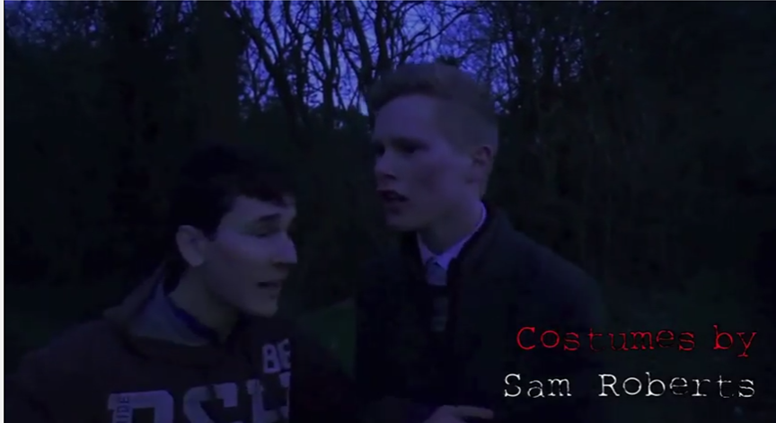
The story of our opening, and the way that the opening sets up the story- In the first two minutes of the 'film' the audience get a hint as to what is going to happen in the rest of the film. There are hints that there is a supernatural element and that there will be a test of friendship. The opening doesn't give much away which leaves the audience to want to carry on watching to find out what happens next. This two shot shows Luke and Tommy. Tommy has just split up the fight between Luke and Kyle and is tired (as you can see from his facial expression) Luke is higher than Tommy in the frame which gives the impression that even though Tommy has just split up the fight- Luke still has the power/authority over the group, and is seen as the leader. This shot includes dialogue and no sound.
|

|
|
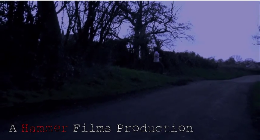
I think it is clearest from the institutions that the film is a horror, and the content of the clips. The genre is evident to be horror from the names of the institutional details such as 'Hanging Productions' and 'Hammer'. The overall darkness of the opening portrays the opening to be a horror as nothing is clear and only certain parts of the frame are in the light.
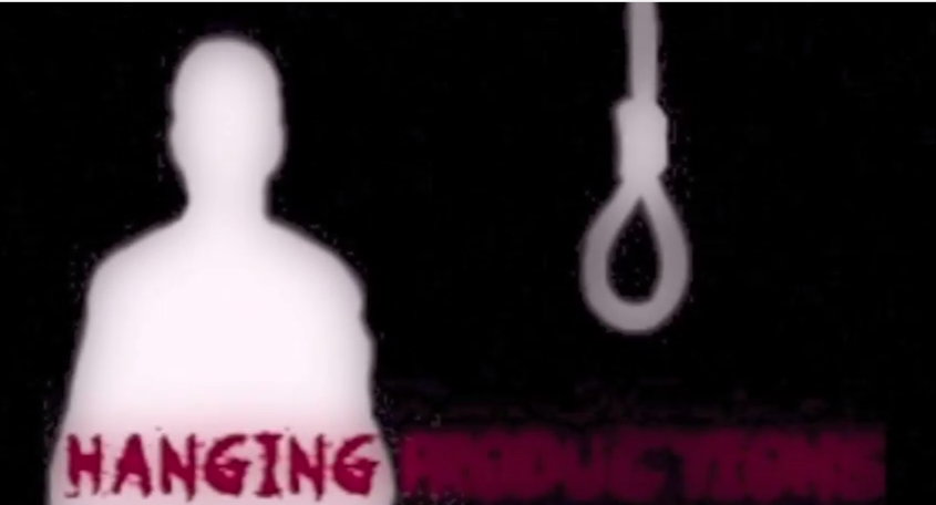
From the name 'Hanging Productions' it gives the impression that the film will be a psychological horror. The noose and the mans silhouette link with the title of the production company. |
|
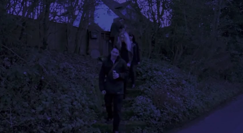
This long shot shows the main characters coming out of the house party after being kicked out. The one who got them kicked out 'Kyle' is at the front and is looking smug and pleased with himself, the rest of the group are angry at Kyle, which is the reason for the fight as they get further on down the road. As soon as the characters are introduced, it is in a negative way. This represents youth culture to be disruptive and aggressive. They are drinking which implies that they are irresponsible, and swear which shows that they are 'typical drunk teenagers'. They are represented to be used to conflict in the group, as the friend that breaks up the argument seems to have done it before. Overall they are represented to be rebellious
|
|
|
This close up shot of the main protagonist Lily, shows her facial expressions to be shocked to have found her watch. The background creates a gloomy atmosphere and aims to give the audience 'chills' at the storyline. Her face and the watch are both in the rule of thirds which draws the audiences attention to these things as they are the most important in the frame. The shot is eye level because we want to audience to be able to relate to Lily. We have used special effects throughout the opening. We use fade to blacks before and after the title and at the end to show a passing of time. We then used x-ray effects for one second during the chase scene. This makes the clip look like something from the supernatural world was chasing her.
We also have used a white screen for 1 second to create a disorientating effect for the audience. |
Activity two- How does your media product represent particular social groups?
We have included representations in our opening. We have done this through the storyline, dialogue, costume, body language etc.

|
Men have been represented by appearance in our opening by appearance and costumes by wearing jeans and a coat. They are shown to be relaxed and casual. Men have been represented to be reckless and clumsy, this has been shown due to them getting kicked out of a party due to Kyle breaking something in the persons house. This then causes a fight between Luke and Kyle, which shows men to be aggressive and unable to solve a problem by talking it out- instead resorting to violence. Even though no physical damage is done, there is still aggression and anger shown by the two lads. They are also shown to be fairly possessive over the females in the group, one of the lads has his arm around Vicky which shows he is protecting her and labels her as his 'possession'. The other lad shows a lack of confidence by walking behind the rest drinking his beer and not really socialising until the argument. The two lads which have the argument have to put their differences aside further on in the film as they are fighting for their lives, this represents friendship and the way the group communicates.
In general, men are usually represented in horror films to either be the hero or the villan, it is very rare that they are the victims. For example, 'The Wicker Man' (1973) is about a man who leaves a young girl traumatised for life after a certain occurrence of events. The Wicker man is portrayed to be powerful and important, this represents men to have more power over women. This shows that it is usually men who put women in danger in horror films and other men who help to save the women. This is similar to our film, however it is unknown from the first two minutes who is going to save Lily, and whether she is even going to be the one needing saving! |
Women have been represented through costumes and appearance by wearing dark colours which makes them appear mysterious and quite rebellious. This shows them to also be 'fading into the background' which shows them to not be important to the opening, this stereotype is challenged in this opening by using Lily as the main character. Women have been represented to be vulnerable due to Lily (the protagonist) running away from something, which shows Lily to be the damsel in distress. When leaving the party after the dream, Lily is very quiet and walks in front of everyone and doesn't really speak, this shows she is feeling emotional which is something associated with women more than men. Lily is running in the first narrative shots to show her vulnerability and how she represents women to be caring about things. When Vicky breaks up the fight it gives her a representation of a peacemaker in the group, she has a solution to their problem which also implies she is smart. This challenges stereotypes as usually it would be a man who comes up with a solution for a problem and leads the group, however we have used a girl to challenge this.
Women in horror films are representative to be vulnerable and to always be the 'damsel in distress'. This is shown from classic horror/slasher films such as Psycho and Nightmare on Elm Street. Women always seem to be the first ones to be killed and often by other men. Women on DVD box's are often used as a form of the 'male gaze' as shown on the two below. This could mean that women are often objectified in the media/in films, which often makes their role taken less seriously.
Women in horror films are representative to be vulnerable and to always be the 'damsel in distress'. This is shown from classic horror/slasher films such as Psycho and Nightmare on Elm Street. Women always seem to be the first ones to be killed and often by other men. Women on DVD box's are often used as a form of the 'male gaze' as shown on the two below. This could mean that women are often objectified in the media/in films, which often makes their role taken less seriously.

|

|

|
|
Youth culture has been represented through appearance and costumes by them being shown by typical teenage dress, such as jeans/trousers and a t-shirt/coat. They all appear to be drunk and tired, which fits with them in the storyline- them wanting to find somewhere to stay. Youth culture has been represented through actions as being loud and disruptive. This has been shown by the teenagers being thrown out of party for starting a fight in the house party. This also makes them out to be immature and rebellious. They are drunk coming out of the party and carry on drinking in the streets which shows they have little respect for the law and their appearance as a group. They are roaming the streets at night in a group which shows them to be intimidating to other pedestrians. They are also walking in the middle of the road which shows their lack of knowledge of road safety. Vicky is shown to be the hero archetype as she splits up the fight between Luke and Kyle, and also offering to pay for somewhere to stay- she is shown in the opening to be more mature than the others. Sorority Row is a similar example to how youth culture is represented in other horror films, they are shown to be irresponsible and lively. Our opening shows this representation as they have just been to a house party and are wondering the streets which shows them to be irresponsible. Kidulthood is another example of how youth culture is represented in a negative way, this includes them getting into trouble with the police and other typical teen dramas. This is similar to the issues in the opening of our film as they are under-age drinking.
'Kidulthood' has represented youth culture from this advertising poster by making groups of teenagers appear very intimidating and separated into couples. The dark background in the mise-en-scene of the poster applies pathetic fallacy to the image and implies something bad is going to happen in the film and gives the idea that the teenagers are going to be responsible for this. The props included in the poster are also relevant as they are items that do not need to be purchased by adults e.g. the baseball bat- anyone can own one, but not everyone uses them to inflict pain on someone else. The title also shows that the youth are growing up from 'kids' to adulthood, this represents the changes in their lives. |


|
Activity three- What kind of media institutions might distribute your media product and why?
Script for the voice over;
Role of a distribution company- Distribution companies help to fund the media product. They are responsible for the marketing of the product and the way it is exhibited, such as through cinemas, DVDs, websites/e-media etc. They are very important to the media product which reflects why they always appear first in any sequence of advertisements such as on trailers. They are important to the media product as they are often responsible for the funding of the product. They also create an expectation when seen that it is involved in a media product. For example, if you see the Universal logo at the beginning of a film, you have the expectation of the product to be a high budget and a successful product.
We have chosen Pathé (a French distribution company) as it works for the production of films, distribution to homes and theatres and works with a large range of film types. Pathé has distributed films such as 127 Hours, Chicken Run, Slumdog Millionaire and Blood: The Last Vampire. The fact that they have distributed such a large range of films means that they would work with our physiological horror film. They would also bring an international audience from their fan base in France and the rest of the world! Our film would therefore be promoted by there existing popularity.
- A production company is responsible for fundraising to make the film, however they often use the distribution company for the funding as they are more likely to have more funds. The funds would come from the different production companies which we chose to use; Hammer films and Hanging Productions. These production companies are both know for horror films. Hammer Films is well known for films such as The Woman in Black, The Resident and Wake Wood, these are all evidently horror films. Hammer film productions was founded in the UK which is where the film has been set which links well. Hanging productions is evident to be a horror film production company due to the logo and the name 'hanging' this also connotes psychological problems. The most money from our film would have come from the distribution company of Pathé.
- Our production name and logo 'Hanging productions' is evident to be a horror film production company due to the logo and the name 'hanging' this also connotes psychological problems. The red and black that we have used connotes horror and death, danger and blood, this fits with the horror genre of our opening. We used this typography as it appears to be written in blood next to the white noose and white silhouette of the man on the right hand side. The cross blur effect that I used makes the audience to feel their eyes go 'drippy' which disorientates them for the start of our opening- this works well due to the horror genre. Hanging productions co-produced Hospitality with Hammer films, we decided to use two production companies as they are not really popular companies which means they would not have a high budget to spend on the product, however with two production companies and a popular distribution company, the budget would have been manageable.
- The various people appear in our opening in a specific order which represents their contribution to the film. The distribution company appears first to show their importance (due to Pathé funding the product). Then the two production companies, as they helped to make the actual film and were responsible for some of the funding. After the images of the companies logo, we mentioned the association of Pathé to show it's importance, again to the film. Then 'A Hammer films production' shows which shows Hammer to have contributed more to the films production than Hanging Productions, this is evident as Hanging Productions are not shown again in text after their logo is shown. 'A Film by..." Is then shown to show the director of the film. This is because it is the directors role to make sure that everything is going to plan and making sure everyone is in the right place. The titles then go through a list of actors and actresses in order of appearance. 'Hollie Morris' is the main character therefore she is shown first, then the other actors/actresses involved are shown one by one to show their contribution to the film. The title of the film is shown after the protagonist wakes/sits up out of bed, this is to build tension (along with the non-diegetic sound stopping suddenly. The names in the titles carry on showing after the titles, the actors/actresses carry on until the 'Casting by' text shows this is next as it shows who was responsible for getting the cast together. These continue until the Costume designer and the Make-up artists are shown last as they are the least relevant to the storyline. As the narrative starts through the titles showing, it takes attention away from the titles, which shows that the most important ones should always be at the start. The typography we have used fits well with the horror film as it appears to have been written on a typewriter. The elements of red we have used in some of the text posts draw attention to the persons part in the film, and adds to the horror convention.
- Our film is similar to films such as The Quiet Ones(2014) which was distributed by Lionsgate, and co-produced by Hammer Films productions and Travelling pictures show. This is very similar to our product as it has one large distribution company, two co-producing companies and is a horror film. Outlaw (2007) had one distribution company and two production companies. It's distribution was Pathé and the two production companies are Vertigo productions and Ingenious Film Partners. This shows that the films Outlaw and The Quiet Ones would have a similar budget to our film which would mean it would be about as popular.
- We have made our opening with a no-budget. We have done this by asking favours for casting, we chose people who do drama at A level as we feel these would be the best people for the parts, due to them being used to being in front of the camera. We borrowed school cameras and tripods from media at school when we filmed, due to none of us having cameras that were appropriate. We asked the cast to wear casual clothes and to appear as if they had just come back from a party. We took empty beer cans to make it appear that the group had been drinking at the party.
- Our film could be streamed online from websites. This would appeal to our target audience of young adults as they are likely to be up-to-date with technology, meaning putting the film online would be beneficial and would be worthwhile.
Activity four- Who would be the audience for your media product?
|
|

|
|
|


Activity five- How did you attract/address your audience?
Please watch with the annotations on :-)
Activity six- What have you learnt about technologies from the process of constructing this product?

|

|

|


|

|
- The new skills I have developed include using iMovie on the Macs. I had only ever used iMovie at GCSE so I had to develop new editing skills and learn how to detach audio from clips, trim clips, change the speeds, put video effects on the make the opening look darker and more like night time. I have also developed skills using a recording camera, I have developed skills on panning and using zoom out and zoom in camera movement.
- I learned how to set a 'day to night' effect onto the videos to create a more realistic night time and make sure that all the clips lighting were the same level of darkness etc. This came in useful as it meant that clips we had filmed earlier on in the day (so it was lighter) we could blend with another clip so you could not tell it had been edited.
- The techniques I think have been particularly successful are the fading transitions that we put in between clips to create an effect of passing time. We used one to bring on the title of 'Hospitality'. This helps to build tension before the showing of the title of the films.
- I have learnt to use weebly.com which has been useful to put all of my coursework in one place online! I learnt how to embed codes for programmes such as Prezi and Youtube. I learnt how to make a presentation and add images and text to a page and how to divide it all into sections on a webpage.
We took part in another feedback showcase event to get information on how our product could be improved. We got the following;
- Less bad language in dialogue
- Louder sound in parts
Activity Seven- looking back at your preliminary task, what do you feel you have learned in the progression from it to the full product.
I will now compare the progress I have made from the preliminary task to our final horror opening, in terms of camera work.

This two shot shows the characters personalities well as it shows the victim to be hiding round a corner and the villan creeping up behind him.
This over the shoulder shot is a transition from shot-reverse-shot this editing technique allows the viewer to watch both the characters facial expressions while having a conversation.

We used match on action as the villan walks through the door when chasing the victim. We felt this needed work as it came across a bit messy and doesn't look continuous.
Overall, I feel that as a group we have developed our skills for camera work- using the camera, and recognising the shot types. Editing, making sure it is in the right format! And ensuring the clips look smooth and continuous with appropriate transitions between clips- for example a fade out at the end, and not in between shot-reverse-shot clips! Also we have developed our learning in uploading things onto YouTube and embedding them onto our weebly's.
|

However, I feel that this high angle shot portrays the protagonist to be more vulnerable than the character on the preliminary task. She looks more uncomfortable and scared due to the lighting and her body language.

We have used shot-reverse-shot editing for our opening too. We had to ensure that we went by the 180 rule to make the clip look smooth when it cuts to the next clip. The shot-reverse-shot here has been used with a slight high angle on the person getting shouted at and a low angle on the other character. The 'peace maker' in the middle is kept at a neutral shot which reflects his character.

When the protagonist Lily drops her watch we use match on action from different points of view from her bending down and to her running off. We feel we have improved on editing continuous shots while taking more time to edit our opening than the preliminary task.
|
