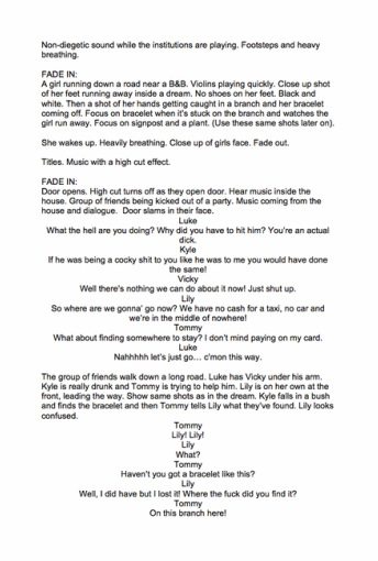
Planning
task two
Initial ideas
|
We wrote down our intial ideas for our horror opening. We did this in the form of a mind map to show all of our ideas at once. We included thoughts such as;
|
Mini documentaries
This is a mini-documentary about the most famous horror movie directors and what the audience expect from a horror film. The other mini documentary is about the BBFC and the history of the genre of horror.
|
History of the genre-
I have learnt from this research about the attention to detail that is required to make a successful horror film. Also about the very first defining horror films which made horror what it is today. I have learnt that a lot of present directors have used techniques from older films, such as the 'zombie craze', slasher films and psychopathic killer characters. |
Iconic Directors-
From making this small documentary I have learnt that even small clips in horror films must be planned out effectively in order for it to reach its target audience. Also that the director of any film is the most important person as they control the whole film- meaning they are responsible for how it appears. |
BBFC-
From this research on the BBFC I have learnt that depending on what content in shown in the film/programme etc. decides which age group is the most appropriate to be viewing the film. |
Audience expectations-
|
|
|
|

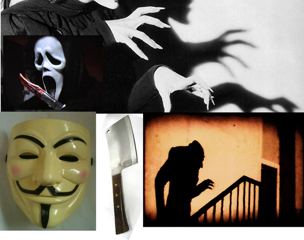
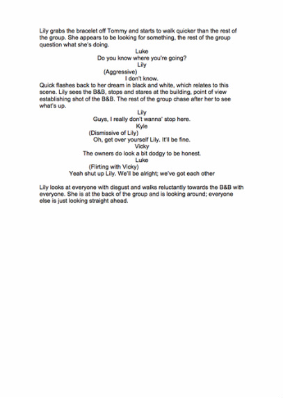
Iconography of horror genre |
WordleFrom this word it out program, I have learnt that the main aspects of a horror film are;
|
|

|
|
|
Insight into horror genreScary films purpose;
'A History of Horror with Mark Gatiss'
This documentary was useful to me for researching where the original horror films came from. From Psycho to The Omen, details of each film that were iconic from the sixties onwards are included in the documentary. Interviews with the directors are included which gives an insight into the thoughts of a real director and what they consider when making/directing films. Making A horror film- the decentA lot of planning goes into making a horror film. For example, in The Descent the production company trained the actress' to be in dangerous environments by giving them some experience at rock climbing and other activities that would benefit them to do with the film that they would be acting in.
|
Why people watch horror films

|
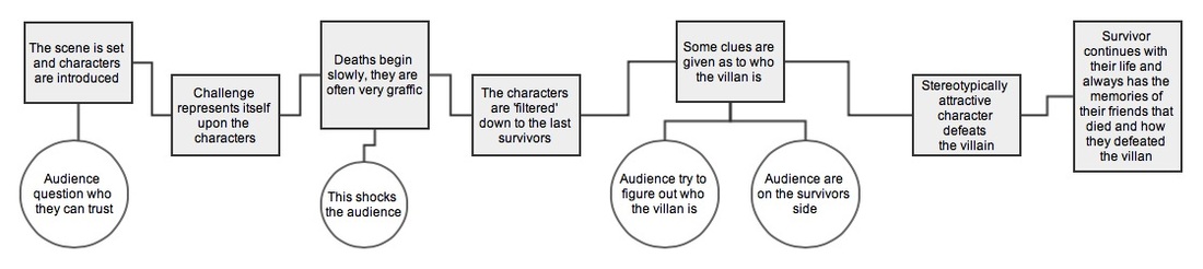
Mind-map of the horror conventionstypical synopsis of horror genre |
Horror is a film genre which is used to typically inflict negative emotion upon the viewer. It does this by identifying their audiences fears, this often startles and shocks the views encouraging them to enjoy the film. Horror films often have aspects of the viewers nightmares and hidden fears, it is important the institutions know who their target audience is before producing the film as this will help them to decide the content of the film. For example, if their target audience was teenagers they might include supernatural occurrences at a house party or at school. Supernatural events often scare people and encourage them to watch a film as this appears more scary than real life events. In my opinion, I think that things that could possibly happen are scarier because you can relate them more to your own life. The typical things included ghosts, vampires, ware wolves, demons, vicious animals ect.
|
Film names, typography, posters etc. evaluation

The name 'Outcast' implies that the film is about someone/something that has been excluded from the rest of society and is possibly looking for revenge. Alternatively the name could suggest that the film is about someone who is rebelling again the norms and therefore becomes a type of 'outcast'.
The tag line ' Evil runs in the blood' suggests that being an outcast is hereditary, which implies that there are a group of these 'outcasts' which comes across more intimidating to the victims. The mentioning of blood also makes it extremely clear that it is a horror film, the blood reference implies that the horror actions that will take place will be gruesome and horrific.
The tag line ' Evil runs in the blood' suggests that being an outcast is hereditary, which implies that there are a group of these 'outcasts' which comes across more intimidating to the victims. The mentioning of blood also makes it extremely clear that it is a horror film, the blood reference implies that the horror actions that will take place will be gruesome and horrific.

The typography that has been used varies on different advertising platforms for the film 'Outcast'. The most popular typography is written in clear, bold white writing. The typography that has been used includes crosses for the 'T's which imply a religious aspect to the film, the star on the 'O' indicates satanists, which gives the impression that something isn't quite right. The fog behind the text adds mystery to the typography and intrigues the audience. The colours used in the typography are clear iconography of the horror genre. This is shown by the red which connotes blood and death, the dark blue used in the image to the right would connote some sort of crime aspect to the film. The way that the red has been splattered across the O and part of the T gives the effect that someone had been brutally murdered (possibly stabbed) and the blood had splattered on. The image in the background shows two silhouettes in a park (next to a swing), this may imply that the 'Outcast' isn't alone and possibly has a 'cult' of people who are also considered outcasts. The fact that they are near a swing set in the dark suggests that they are mysterious characters and are always lurking in places at times when nobody else is really around.

The distribution and production companies along with the actors names were all included in the opening sequence of the film. They appeared to be under a dark, dirty and creepy cave. The text was surrounded with blood and cracks in the wall, this created an intense atmosphere and gives an obvious statement as to what genre the film is. The companies and names were all in order of importance, the distribution first, then the production companies then the actors names. It is apparent that the amount of time the names were up for represented how important they are to the film.
The name of the film is in the opening of the film at 2 minutes in, this gives enough time to get the audiences attention and give them some clues as to what will happen in the rest of the film. Instead of editing the name of the film into the clips like usual films, the institutions have decided to incorporate the name of the film into the location. The fact that it is written as part of graffiti shows the social class of the area that the film is set to be low. The graffiti stands out above other white writing on the bridge to show its importance over other writing. The 'a' on the word 'outcast' could be a gangs logo or an anti-religion symbol. The 't' is an upside-down cross which implies that the theme of religion will be important throughout the film. The symbol on the 'a' also matches an item that is shown in the car clips hanging off the mirror. This implies the man in the car is the main protagonist and possibly the 'Outcast'.
The name of the film is in the opening of the film at 2 minutes in, this gives enough time to get the audiences attention and give them some clues as to what will happen in the rest of the film. Instead of editing the name of the film into the clips like usual films, the institutions have decided to incorporate the name of the film into the location. The fact that it is written as part of graffiti shows the social class of the area that the film is set to be low. The graffiti stands out above other white writing on the bridge to show its importance over other writing. The 'a' on the word 'outcast' could be a gangs logo or an anti-religion symbol. The 't' is an upside-down cross which implies that the theme of religion will be important throughout the film. The symbol on the 'a' also matches an item that is shown in the car clips hanging off the mirror. This implies the man in the car is the main protagonist and possibly the 'Outcast'.

The name 'Wake Wood' gives the first impression of someone/something being awoken, due to the horror genre this may imply that someone/something has been awoken from the dead. The title also implies some connection with a forest or field which is often considered a spooky place, woods are often associated with new life which links in with the 'Wake' in the title.
The typography is bold and written in block capitals, which shows the dramatic and bold storyline. This way the title has been written in a way which resembles a trees bark formations, this backs up the title of 'Wake Wood', the typography has a hint of mystery to it which draws the audiences attention. This tells the audience clearly that the films setting will be in a natural location and this is where the horrific scenes will happen.
The tagline 'The dead should never be woken' is also written in block capitals so that it stands out and catches the audiences attention. Again, this suggests that the person who has been 'awaken' has not been awaken for a positive reason, which would scare the audience without even watching the film yet. The colours that have been used for the tagline and the rest of the poster for 'Wake Wood' are autumnal colours which are classic colours associated with the woods. The orange and black also connote horror and new life. In the opening for the film, 'Wake Wood' appears right at the beginning which shows the names importance to the story. The title is followed by a series of establishing shots of large green fields in the countryside. The institutions of the film are right at the beginning as they are important to the production and distribution of the film, they are written in the same typography as the title for consistency. Hammer productions are well known for their gothic horror films which shows the audience clearly that the film is in the horror genre.

Black sheep's title obviously implies that the film is based around the dark side of sheep. Sheep in general are not intimidating animals which inflicts the element of surprise onto the viewer. The unusual title implies that it is not a normal horror film, it is a hybrid with comedy, I think this would be because sheep are not in usual horror films, it is usually ghosts, demons, werewolves ect. The typography that has been used is in bold block capitals which is very clear on the DVD cover. The image of the sheep inside the 'A' adds character to the typography and makes it specific to the film. The way the title is written is in a 'fluffy' style font, this goes with the sheep element to the film, this has been used to create a consistent effect throughout the typography. The 'A' has a stereotypical silhouette from the zombie genre, which reflects from the horror of the title.
The tagline 'Get the flock out of here' shows the films comedy element, with the reference to the sheep. The typography of the tagline is the same as the title which draws attention to the tagline as much as the title.
The main colours used applies to the rule of three, of red, dark blue and white, this is relevant to the horror genre. The white of the sheep also goes with the white colour theme. The institutions are written in red so they stand out from the rest of the image, this shows their importance.
The placement of the name in the opening scenes is after the institutions. The way the name is presented is fitting with the genre well, the image of sheep fur emerges around the title 'Black Sheep' followed by the wording being 'splattered' with blood. The institutional names are written in white before the title of the film to build tension for the audience. The fact that the institutions are before the title shows their importance of the production to the film. Actors/actress names are also mentioned after the title and institutional details, they are shown in order of importance to the film with the male lead protagonist and then the female. Things that are shown in the mise-en-scene in the opening sequence include sheep, children, an axe and blood, this is representative of the horror genre.
task three
Still frame analysis- ginger snaps
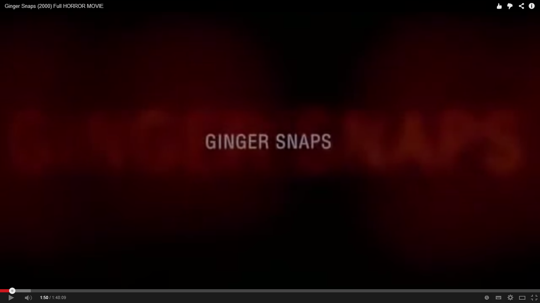
Titles- The title shows at 1:50 into the opening of 'Ginger snaps'. The red fog around the text implies the horror genre well, it shows that the film will include blood and gore and obviously death. The typography of the text is plain but in capitals which shows that the title is important as it stands out from the red and black in the background.
|
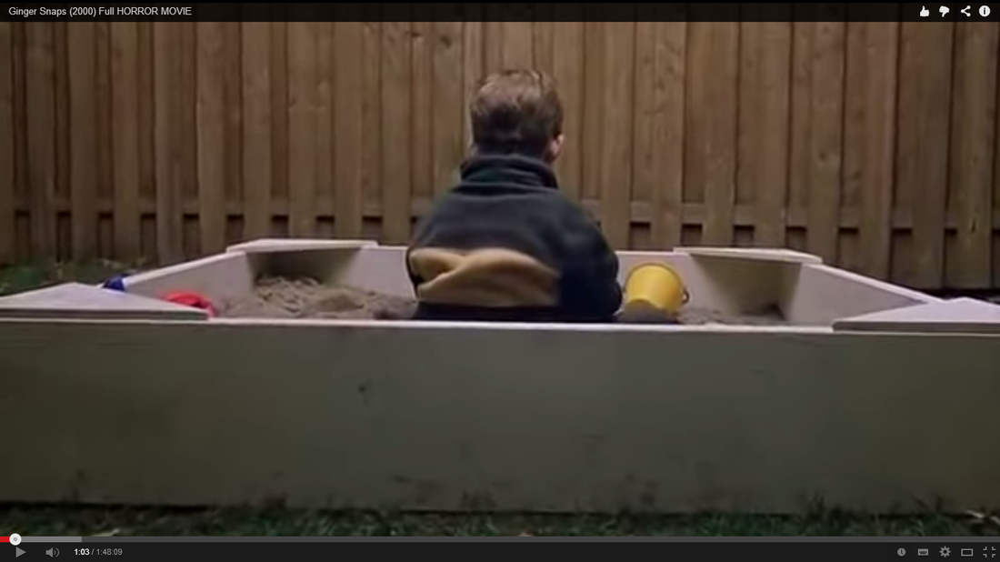
Camera work- I found this wide shot interesting in the first two minutes of the film as it appears to be a pint-of-view shot, meaning someone/thing is preying on the child in the sandpit. The woman who is also in the scene is presented to be innocent however, it makes the audience question what is going to happen in the rest of the film with consideration of the baby. The plain fence in the mise-en-scene gives the impression that the baby is isolated, and is easy prey for a villan character.
|
Storyboard in reverse


|


|
9 frame analysis
What should be included in the first two minutesThe key points that I have included in the video of what should be included in the first two minutes include;
|
|
Task four

We decided to call our production company 'Hanging Productions', we chose this name as it represents death/suicide and possibly the darker and more mysterious type horror films. We felt that 'Hanging' represents the horror genre well as it is often associated with death and psychological issues. We used the typography because we felt that it shows the horror genre well, the lines and detail in between the letters could be seen as blood that is dripping, which gives obvious connotations of blood and murders. The capital letters show its importance and the bold writing shows that the films associated with this company will be 'over-the-top' and very gruesome and graphic. The typography also makes a statement to show that the institution will be different to other institutions and will be worth watching.
We used mainly red and black in our institutional logo, this is because they are the main conventional colours that are used to represent horror. The red will connote the blood and gruesome deaths and the black shows the mystery and the 'hidden elements' to the film. We felt that we should use images to represent and work with our title 'Hanging productions' therefore we used a silhouette of a man next to a noose. The logo could be considered mysterious as the audience would want to know whether the person (of who we assume is a man) is going to hang themselves, or possibly someone else! I also feel that the image represents the physiological hybrid to the film as it arrises some questions about the silhouettes mental state, what is provoking him to hang himself or someone else. The effect we added makes the logo look hazy and blurry, this might be considered to be quite disturbing to the audience as it would create a haunting effect.
We have chose to work with the following institutions;
Pathe Pathe will distribute our film, they have distributed many other low-budget UK films such as Dog Soilders and The Hole. Due to Pathe working with independent films we feel that they would be an appropriate distributing company to use.
BFI (British Film Institute) The BFI is a charitable organisation, which means they would help to fund our projects as we would have a very low budget. The BFI exists to promote the access and appreciation of film and moving image culture in the UK.
Film 4 Film 4 funds small projects and helps distribute them across their channel (Film4). Film4 productions are responsible for backing many successful films from the UK.
Hammer Productions As Hammer productions are extremely popular we would like to work in tandem with Hammer Productions, this would help advertise out film and make it clear as to what genre it was right from the beginning, as Hammer Films are always horror films.

|
|
|
|
Questionnaire
I asked the following questions to people who enjoy watching horror films to find out how they would react to our horror opening, and to get some ideas on what the target audience of young adults would enjoy and what they expect from a horror film.
|
What is your favourite horror genre? (In order of popularity)
|
Which setting do you think is best? (In order of popularity)
|
task five
1st attempt at planning

Our initial ideas for our horror opening includes;
- the title
- the horror hybrid- physcological horror
- the location
- the characters
- the story line
- what will be included in the mise-en-scene
- the sound that will be used
- the type of action included
- institutions
- Pathe will appear first in our opening for 6 seconds
- The BFI will then be shown for 4 seconds
- Then Film 4 and Hammer Films will be shown over the narrative shots
- The narrative shot will be in a kitchen of a woman chopping meat.
|
|
SynopsisIf you inherited a property from your parents along with your siblings, would you go to the same extreme as this family? In this film you will see the lengths people will go, to prevent change and carry on as normal- no matter what.
After being kicked out of an out of control party, a group of friends are too far away from home- and far too drunk! To even think to go back. They stumble across an impaired looking B&B, and see this as the only option from the streets. Little do they know this night will test their friendship like never before. Instead of making their way home, they decide to try and survive a night in a family run B&B. Little did they know this was no ordinary family. The failing family business lack funds to continue their business honestly, they will go to large extremes to keep their legacy to their parents. Who survives? Who dies? Who's hungry? |
Interview for horror opening
New group- planning
|
We have decided to join another group as we think that our ideas put together will make a more successful film opening. We have merged our ideas together and this is the outcome.
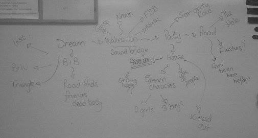
Initial ideasThis image shows our initial ideas in chronological order. We have taken into consideration the placement of the title and how the narrative shots will build up to this. We have also thought about what type of editing effects we will use- e.g. we are making the beginning shots black and white to show it is a dream. Also, we are including quick short shots of the dream after the titles to create tension.
|
|
Location photographs |
SynopsisAfter being kicked out of the party of the year, a disheartened group of friends begin their long walk to nowhere with no means of getting home or making any contacts. They take their chances stumbling down a long country lane arguing about the 'events' of the party.
Further on down the road, Lily has visions of her group getting thrown out of the party and then arriving at a mysterious looking B&B but dismisses it- convincing herself it is nothing but a simple Deja Vu. As the group ponder any possible way of getting home, much to their surprise they arrive at a homely looking B&B after booking in and sorting a room for the night. What will this night bring? Is the group in danger? Feeling fairly apprehensive, Lily causes a stir with her friends but is dismissed and told to 'chill out'. Will the group of friends listen to Lily? |

Character analysis
Flow-diagram of opening sequence

Props list
|

|
|
shooting script
|
|
|
Costumes and make-up
Animated Storyboard
|
|
FeedbackOur media teacher Mr Bradnick watched our animated story board and gave us some feedback.
The story and genre is clear. The sound has been explained (dialogue). Edits have been explained and what's in the mise-en-scene has been shown in the drawings, including the bracelet and pansies. The timing has been explained with the edits in most shots. "I like the repetition that has been used with the bush and fence post. I think this is effective because it shows the story without telling it." This is the feedback that we gained from other students on our Animatic Storyboard and on the general storyline.
(video to the left) From this feedback we have found that we need to make the drawings to a better quality drawings to represent what the images are showing better. |
Typography

|
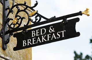
We narrowed the typography ideas to these (to the left). They show the genre of horror well as some of them appear to be written in blood.
We feel that the last one would be the most effective as it looks to be a sign for a B&B which is relevant to our film. We feel that the typography and idea for the titles of the film would be on a sign which would give the audience a clue as to what was going to happen in the film. |


|
This was our first draft of the titles for Hospitality. We decided that it was too over the top and did not represent our film appropriately. It did show the horror genre well with the cross on the 't' and the satan symbol, however this is not relevant to our storyline and looked a little too much like Outcast. We decided to make a new one, but kept the same typography.
|
|
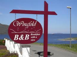
This is our new attempt at the titles for our film. It is written on the silhouette of a B&B sign which gives the hint that the film will be set in a B&B, along with the title, this gives a clear impression of what to expect from the film.
We decided to use the same image with the 'no' removed, this will flicker in the opening sequence which will give a creepy and haunting effect. 
|

|
Titles and Credits
First will be the distribution company which is Pathe films and this will go on for 4 seconds.
Then hammer films the production company which will last for 4 seconds.
Then hanging productions for 3 seconds and then butcher productions for 3 seconds, these are the last two production companies.
Then as the film is playing we will have film 4 in the bottom left playing over the film. Then we will leave it playing for 5 seconds to allow the audience to get in the action. We then have 'A film by Chloe Garner' rolling for 2 seconds in the bottom left of the screen.
Then after 2 seconds we will have 'Sophie Clarke' in the bottom right then straight after we will have 'Shane Fredricks' for 2 seconds in the bottom left then straight after in the bottom right 'Samantha knock' then straight after 'Jordan Lewis' in the bottom left for 2 seconds then 'Jack Bridges' in the bottom right for 2 seconds.
Test shots
Location photographs- megs lane
Filming Schedule28th January 2014
30th January 2014
4th February 2014
6th February 2014
11th February 2014 (back up day) We will use this day to ensure that all the clips we have are appropriate and are right. If anything is wrong, we will use this day to take any more shots that we need |
Editing Schedule29th January 2014
This is our first editing lesson and it should be used to start clearing out all of the bloopers in the film or parts we don’t need.
3rd February 2014 In this lesson we will need to make the institutional clips at the beggining Friday 31st January 2014 (Extra time if needed) If we can use today we should continue forming the film Monday 3rd February 2014 We should be continuing the forming of the film today and should complete it Wednesday 5th February 2014 We should be done putting the film together and start getting the institutions put in Friday 7th February 2014 (Extra time if needed) If we can all make it today It would be good because then we can finish the institutions and start concluding the film. Monday 10th February 2014 We should be finishing this off editing off now of our two minutes. If we can do it before then it would be better. |
Rough cut of opening
We made a rough cut of our horror opening so that we could get some feedback on our ideas so far.
Interim feedback
On Wednesday the 12th of February, our group took part in a showcase in the aim to get feedback from our first cut of our horror opening. We hope to use this feedback to create an action plan to improve upon our final product.
Positive feedback

Institutional details
Feedback received from Mr Anderson, was that our choice of animations and company logos were convincing and suited the genre of horror well. This is due to the way we edited them and put colour filters on the images. We had to manipulate some of the company clips for example, we had to cut the chicken out of the end of the clip. Genre Genre was clear by the non-diegetic sound we have used, the colour filters on the institutional details. Opening vs trailers Miss Harris-Ayre said that it is evident that it is an opening rather than a trailer. Sound The thunder that plays during the institutional details is effective as it builds tension. Edits/transitions The x-ray effect was effective as it gives the impression that someone is watching her and it gives a supernatural effect. |

Camera work
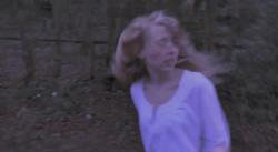
We have used a variety of shots which look effective. We have used a lot of different shots where Lily is running in her dream to disorientate the audience when watching. This makes the audience feel sympathy for the main character and want her to survive. This eye level shot of Lily is when she wakes up from the dream and is upset and distressed. We have used shots from different angles when she wakes up to created an effect which disorientated the viewer. The mise-en-scene in this frame includes a crucifix which shows the theme of horror without telling the audience anything, it has been placed there to show Lily's character to be innocent, which makes the audience side with her and want her to survive throughout the film. Narrative The chase scene is obvious to be a dream, this is clear as the clip shows her waking up after. Also the fact that she wakes up feeling upset and clearly from a bad experience it shows that she just had a bad dream- this makes the audience think that's all it was. Title The typography is effective because it is quite gloomy looking and is bold. Wording It is clear to the horror genre as similar typography is used in other horror films, the typography is recognised as a horror convention. |
Constructive feedback

Title
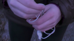
The title itself has been shown for too long in the rough edit, it needs to be on for less time. The title 'Hospitality' isn't relevant to the narrative shots that we have so far, this confused the audience at the interim feedback as they didn't see why the name was relevant. We need to add more clips to make the title seem more relevant and match with the narrative. Wording Need more institutional details. Edits/transitions Some clips are too quick in the chase scene. Also the end clips need to be adjusted so they are on for the right amount of time. Narrative It is not quite clear as to why the two boys are arguing. Also swap the earphones for a bracelet or something more personal to the character.
|
Camera work
Mr McCarthy said there should be more point of view shots during the chase scene, so the audience can relate to the character instead of just watching her run. We will add more point of view shots and include more lock-down camera movements to add mystery to what else is happening in the frame. Genre The genre could be made clearer by including more elements of horror films, we have used a crucifix to convey a supernatural element when Lily wakes up from the dream. We could also make the genre more apparent by filming at night so it looks scarier, and more like a convincing horror film. Opening vs trailer We could make our opening look more like an opening by including more information about the individual characters. Institutional elements We need to add film 4 to the institutional details at the beginning. We were told by Mr McCarthy that film 4 would be with the other institutional details instead of just in the title credits. Sound The river non-diegetic sound was on for too long and it needed to be quieter and fade out instead of just stopping suddenly. |

Action plan
We plan to do the following things to improve our opening seqence;
- Re-film- We will need to arrange a time with the actors to refilm the narrative scene, the scene where she wakes up, the chase scene and where the group of friends get kicked out of the party.
- Edit- We need to edit these clips into the opening that we have so far. We need to make sure we have a variety of shots so we can see which ones will look best.
- Sound- We need to change the sound so it goes with the new clips and add it to the opening.
- Edit- We will then need to edit it into the opening and do any more editing that is needed.
COstume for chase scene |
Health and safety considerationsThe health and safety considerations for filming our opening include;
|
